Monday, June 30, 2008

Yo Ho Ho And A Bottle Of Rum


I drew this illustration for a book of Pulp literature. I tried to do an evocative and a little erotic drawing of the epoch of the pirates (several years before the Disney movie). Then the publisher decided to cut the illustration away for the cover design, leaving out a good number of details (pistol, boots, ropes...).
I have never been blessed with the colourists that have collaborated with me. It must be the curse of the damned colors...
This is a good example of it.
Argh... ¿Where is my rum?

Sunday, June 29, 2008

Big man, big axe


This is the last page published of Sage in Spain. The original idea was to be published in a giant format, so I drew a heap of lines and manual textures. Then, the publisher decided to include it in a magazine with usual comic-book format, so all these lines and details turned into black masses, doing darker the final printwork.
In spite of everything, I am satisfied of this page. This one shuts up a personal homage to BWS in the panels 1-3-5. And the image of greatness of the last panel keeps on showing a sense of nobility that I like very much.

Saturday, June 28, 2008

Roc's first appearance.


It is not easy being a Troll. Less if you're a little stupid Troll. Roc was the brute of the couple protagonist, and the comical counterpoint. While Elder was the wise man who always knew what to do, how to do and when to do it, Roc was driven by his lowest instincts, always wrongly, landing over his head.
Anyway, in a good fight you would like that Roc was next to you, not in against yours!.

Wednesday, June 25, 2008

Hypothetical lookalike


Except special cases, in which a publisher asks me for a similar lookalike for a personage, I never use photographic references. In this scene of Hypothetical Lizard, where I used faces of friends and partners for the scene of the guests. I drew them directly from my memory.
Even the grotesque man who is standing at the door, who was a partner of apartment where I had my study.
Wild nature.

Tuesday, June 24, 2008

Who said "FEAR"?


This is a close shot of a page from my very first submission for Marvel Comics.
In this time (more than 12 years ago), I was very interested in showing every small detail and realizing a very finished pencil. My biggest influences were Neal Adams, Frank Brunner and other major authors of the old school, before Liefeld and his impossible positions. That's why my vision of DD was an athlete before a superhero.
I hope to be able to post 5 pages of this old submission on next days so that you could see the whole lot.
I am a man without fear of criticism!

Sunday, June 22, 2008

Whiskey & Bullets


He is Plague, the main character in the Mortualia series. He was a Knight Templar that died during the Crusades and keeps on fighting against the dark forces at present, although more pissed off.
In these two vignettes we can see how he recovers of his wounds and how he fortifies himself with a good whiskey gulp.
Maybe he's dead, but I can tell you that he's not stupid...

Saturday, June 21, 2008

More about Moore's


Just a couple of pages from Alan Moore's hypothetical lizard. If you saw my last post about this series --lizards everywhere--you can see the difference between the original tones I showed from my direct scans and the tones reproduced in the Avatar's issue. I feel that something was lost in the printed reproduction...


Some subtle white tones and graduations of gray, although I am quite sure that the publisher tried to fit to the maximum to the originals because it was a very important project for him. As much as for me.

Friday, June 20, 2008

Black Wolf, White skulls


A new pin-up of Ghost Wolf.
In this occasion a shot to back light, where the big black area predominates over a few details in white.
Such high contrast was necessary for a promotion in which the text was standing out on the black background.
Simply and effective.

Thursday, June 19, 2008

Mortualia


Already I posted a cover for the old Mortualia series (1998... ten years ago!).
Now I show the promo and an interior page of the first chapter.
When I drew this series, the publisher asked me for accommodate my style to John Romita JR. For me it was not any problem, because the JRJR's artwork is one of my favorites. But I did not limit myself to seeming to Romita, but I set much of my own art to illustrate this history.
The promo I must admit that it is very similar to Romita's Daredevil. It was my fault.

Wednesday, June 18, 2008

Splah-Page


Splash-page of Mool. This illustration finished a very interesting episode for me as a comic-book artist, since there were 8 pages without text.
Of such form, my narrative turned out to test how to show a finished adventure with only the support of the drawings. I'm trying to find the rest of the pages because it could be interesting to show them here.

Monday, June 16, 2008

Chak-Mool


This is one of the characters (Mool) that my brother and I create for a Sword and Sorcery Spanish magazine. It was during an time of incessant work, in which I went so far as to pencil and ink 50 pages in one month.
I am sure that so much work was not harmful to my art, but on the contrary. I was capable of learning a routine of work in which every line was the definitive one to do the deadlines in the right time.
It was one of my favorite histories and I could use myself thoroughly with manual textures, storytelling experiments and fantastic realism. I will return on it.

Sunday, June 15, 2008

Hurry Up!


This week I'm gonna be very busy, so today I'll post something simple: Conan's quick sketch.
Very often, the sketch shows up more spirit than a finished drawing with more time.
I believe that, in some occasions, a rapid note is more valuable and artistic.
I hope that I got it with this one.

Hands off!


This is one of my very first pencil commissions. It is ancient, of the 1999 year as you can see in the signature.
In that time I was an obsessed one with every little detail. And in this illustration there are a lot of them: the hairs, the belts, the tattooes, the stone walls, the cordage of the chair... and the money bag, where you are able to see size of the coins that are enclosed on it.
I think that nowadays I would not do a drawing like that again, unless somebody would ask for it definitely.
I'm pretty sure that so much detail is not necessary for a good illustration.
At least, nobody pays for so much work.

Friday, June 13, 2008

He is the law!


I think that this page needs few explanation. One of my favorite characters in one of my favorite artwork.
I have always liked Judge Dredd, and when I was asked for a five-pages submission, I worked very hard: with a very detailed backgroud, secondary characters' design in an almost caricaturesque style so that Dredd could really stand out and black, white and grey textures.
Later, a lot of people have asked me for commissions of Judge Dredd and I have enjoyed very much drawing them, but never I've done it with Stallone's face...

Pirates time!


This illustration was commissioned for an adult magazine whose name has a lot to do with the skull of the flag.
It belongs to a portfolio of four more illustrations, but I am afraid that it is the only one that I can post for all the publics.
I tried to suggest more than directly show in this one. There are little details to prove it. Even the map of the treasure encloses a private pleasantry related to another series that I was drawing at the same time.

Thursday, June 12, 2008

Self-Rejected


This illustration for a card for Marvel Origins game never worked. If I look it separately I can´t see where is the fail...
I changed the face three times, because I wanted to respect the foreshortening of the body (a wounded Wolvie), but I did not manage to remain satisfied with. So I didn't send it to the publisher but I kept it to look at it from time to time.
So, a drawing that does not work is a drawing that does not work.
And the mystery remains.

Tuesday, June 10, 2008

Now and then


I have just found in a cd a lot of old stuff: covers, promos, sketches and old pages of mine.
I'll begin posting this illustration. It was the front cover for the second number of Mortualia, a series for the Spanish market. You can see the room I left at the top for the title.
I will post some of its pages to show what the the publisher asked me to draw.
It was something interesting for me as a drawer.
But for now, only the cover.

Monday, June 9, 2008

Hyborian Adventures


During an certain time of my artistic life, the publishers were offering me mainly comics of sword, sorcery and witchcraft. And I loved it.
I did series with my own characters (Sage, Mool...), others (Ghost Wolf) and with the main character of the genre: Conan the barbarian.
Now I'm posting a single page and a detail of other one from Conan.
It was an exciting adventure of drawing, because in a short number of pages I could synthesize (almost) all the elements typical of the cimmerian.
Now I'd better get back to hard work, because there are a lot of things to do, so I am afraid that I'm not posting as often as till now.
Although I will try it.

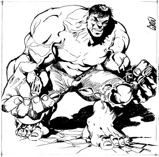
Big, green and angry...


... need I say more?
A rough commission for one of the visitors of this blog.
Hulk smash!!!

I like grey


As I said in a previous post, Siku's work for Ghost Wolf was published in color. When he left and I took charge of the series, a new format in the magazine decided to print it in black and white (and that was my intention when I drew it).
When the first chapter was finished, the publisher wanted to edit it as an one-shot, and he wandered which way would be better: in full color or in b/w. I suggested a third option: tones of gray. And I presented this page as example. In the end, the USA, French and Spanish editions were in color.
But I keep on loving the high contrast of the grey.

Sunday, June 8, 2008

She (is a) Bat


Other illustration for a vampires' book.
In this time I was much satisfied with the texture of the wings and the transparence of the cloths.
It is very difficult to title this drawing without incurring in legal problems of copyright, so I call it she-with-hairy-wings.

Dusty Trail


This page is from a comic called Dusty Trail. It was a revenge history that took place in the Far West. My basic idea was doing a classic western, but the publisher asked me to focus it towards an adult public (adult comics usually sell better than the usual ones. At least in Spain. Do not ask me why). So I did in that way: good-bye to John Wayne, welcome to Angela Broken-Doll! It was published in spanish, english and --I'm not quite sure this time-- french.

By the way: I am grateful for all the comments that you're sending to my e-mail. You all are very kind. I promise to answer all, but I need little time... Remember that patience is a big virtue.

Saturday, June 7, 2008

Lizards everywhere


Alan Moore's most critically acclaimed novella is coming to comic book form with stunning grey-painted art by new sensation Lorenzo Lorente” (Avatar Press)

This multi-layered story is set in a fantastic world of wizards and magical creatures, so I tried to do something special with the art. I felt that the grey-painted look and high detailed textures were perfect for that kind of atmosphere...
A truly hard work, but it was worth all the effort.

I'm posting a single page and a detailed shot from another. I have to say that I used my own face as a reference for the frightened wizard... but it's overaged. I'm younger, gallant and charming!

Friday, June 6, 2008

Sage


Old stuff... This illustration is about Sage, a Sword and Sorcey character that was created and developed by my brother and me for the Spanish market. The original idea was to do a Hispanic Conan. So we invent a whole world of adventures for him and was published as complement in the regular series of Conan the barbarian.

Pull the strings!


Not long ago, great artist Chris Wahl published in his blog a terrifying drawing of Bela Lugosi as Dracula.
I remembered that I had done a portrait of Lugosi for a Spanish book on vampires. I looked for it and here it is. Pencil, ink and a little of digital finishing.
No garlic this time.

Wolvie-Com


Another commission ordered by a fan of Wolverine. I am posting this time the preliminary b&w work because I did not keep copy of the inked drawing. In any case, my pencils usually correspond with the inked work, so I suppose that this sample gives an idea of the final result.

Thursday, June 5, 2008

Spider-Com


This is one of the commissions that I'm usually asked for.
This pin-up in particular was realized to illustrate an article on comics in a Spanish newspaper. Since it was going to be reproduced in not a big size, I decided not to draw too much backgroud, but a big close-up from Green Goblin's mask.

More Wolves


A single page from Ghost Wolf, published in Spain and USA. I was hired to continue the series when Siku, the artist best known for his Dredd work, left.
I created a graphic style not to break with his esthetics, but I was deriving to a miscellany between Bisley and Mignola that I found very expressive and specially fun to do.


The comic was edited in color, although I keep on preferring the original b&w version.

Wednesday, June 4, 2008

Watcher of the Skies...


watcher of all... like the old Genesis' song.
This is another illustration for my brother's magazine cover.
The first Uatu, in black and white, was my first proposal. Then my brother decided to include the first cover in the drawing instead of the newspaper, and he did it, although its size was no perfect fit...


Anyway, the legend that lies in this cover is: who watches the Watcher?
Yes.
The whole classic one.

Tuesday, June 3, 2008

Afraid of the dark


This is the sample artwork I sent to mr. Quartuccio, from SQP.
Then we have a meeting in Barcelona, and he asked me to do several illustrations for his publications. All of them had to be “dark and erotic”, and I did.
But this one was my favourite. I think this is darker... and the most erotic too!

Elder & Roc


A Sword & Sorcery project for the spanish market.


There were two main characters, Elder, the old and wise man, and Roc, the big troll, in the old mood from Fritz Leiber.


It was a very funny script, so it was so much easy to draw it!
I'm posting two pages and a detail for a third one.

Monday, June 2, 2008

Parody, please


I was asked for a erotic parody comic. I've been a great fan of the Star Wars universe, so I thought it would be great to do something with it. The comic worked very well: even some SW fan-clubs wanted to buy the originals.
I did some samples for free, because I've never thought about selling my own pages.
Instead of it, I prefer to do commissions about everything I'm good for.

Forge


A single shot about the mutant Forge.
With a very simple color as reference for the definitive illustration for the card game.

Sunday, June 1, 2008

More Cards


More sample art featured in the Marvel Origins card game.

I include the preliminary art for a Captain America's shot which I intended to be in the old and great Steranko's way.

Close Up


A closer look to a pair of cards from Marvel Origins. They were colored and reproduced from the original pencil scan, without being inked.
Later, I was asked for several commissions of Banshee character by an art dealer in USA, selling a lot of them.

Ghost Wolf mooning


Another pin-up for the USA edition of Ghost Wolf in two versions: original black and white and colored. I drew it thinking about his b&w reproduction, that's why it has such a strong contrast.

As a funny thing: I publish this illustration on the Comics2film art forum and a guy contacted with me asking for permission to tattoo it in his arm.


I hope he'd choosed the b&w one!

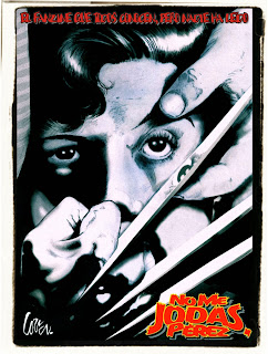
Un chien Canadien


This illustration about Wolverine, based on the original movie poster Un Chien Andalou ("an Andalusian dog") from Luis Buñuel, was requested by my brother Grego for his fanzine No Me Jodas, Pérez.

I think it has a great visual impact.

Trading Cards


These are some of the illustrations requested for the Marvel Origins card game .


There are many more, so I'll post little by little.
My biggest surprise with this order was to see that they used my Thing Vs. Dr. Doom illustration for original featured game.